Good Design is Not Just Because I Can
 But all things are cyclical and what was old is now new again. Retro has been in vogue so often that it is hard to say when the incarnation of what is now retro actually is. Each revival adds its own spin that posterity will mark as a separate style like an endless software release of new versions of the same application. Such is the case for some of the new furniture I am seeing in galleries and exhibitions. The lines seem to be the same but ornamentation is sneaking back in the form of wood grain. It seems that our global marketplace has opened furniture makers up to the entire palette of wood and like kids in a candy shop we are consuming anything we can get our hands on. The problem with this is I’m not seeing the restraint that defines good design. Just because you have hundreds of wood species at your fingertips does that mean you need to incorporate all of them into your table or chair?
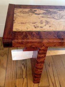
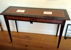
I think the wood can tell a great story but less is more when considering figured wood. A highly figured board can be stunning, but when exploited to cover every inch of surface in the piece, that lovely figure becomes distracting and even tacky. Now when the designer decides to contrast with a different species and makes that one figured as well. It’s like wearing stripes and plaid! You certainly don’t need an additional pop of inlay to punctuate the chaos between those conflicting figures as that just confuses a lost cause.
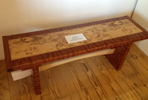
 The pieces seen here are just a few from a gallery that I ran across this summer and I honestly don’t even know who the maker is, but I took pictures because they reflect a growing segment of designers that seemed to have lost the ability to edit. Just because you have access to all these wonderful and exotic colored woods doesn’t mean you have to use them all! Believe me as someone who derives at least part of my income from the lumber industry, I want people to buy exotic woods and to utilize figured woods as well. That’s the best way to protect them. But let’s use them sensibly and not waste them. These figured woods are truly unique and when too much of them is used, it just dilutes the impact and even distracts. Frankly to me, it’s ugly! Let the shape and line tell the story. The bench pictured could have been really beautiful on the merit of the shape alone.
Can you imagine how much farther this highly valuable pommelle Bubinga could have been stretched if the craftsman would have edited themselves to just using it for one element? Obviously this is all my opinion but I think history will back me up when one looks at “masterpieces” in museums and books. Its not just figure either as I have seen many pieces where 5 and 6 different species were combined to create a patchwork piece that just falls short. Personally I try to restrain myself to just 2 species in a piece and if I go beyond, the additional woods are used in tiny amounts like inlay. Lately I seem to have gone back to a single species (not including unseen secondary parts) and a pop of contrast here an there with another wood.
Am I crazy here? Is the greater availability of exotic hardwoods only making us lazy in our designs?
Your Turn
How do you edit yourself when building? Is there a time when many wood species and lots of figure can make a good statement?


