A Design is Born From Ugly
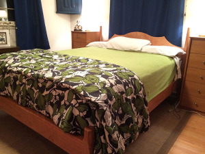
I finished a bed recently for my guest room. I’m really happy with the build but now more than ever I really hate the flanking Lingerie chests that my wife and I bought decades ago. Truthfully I didn’t much care for them when we bought them but this was before I became a woodworker and didn’t really know anything about furniture anyway. I don’t even remember where we got them but its a safe bet it was some place like Wal-Mart. They are boring and cheap with plastic laminate MDF and knockdown hardware. We replaced the faux wooden knobs years ago with metal ones to try and dress it up. What’s that expression about dressing up a turd?
The thing is from a functional perspective they do a great job. My wife loves the multiple drawers and keeps a lot of stuff in there. Its to the point where whenever I talk about getting rid of them she immediately gets protective because of how useful the storage space is. The drawers don’t pull out cleanly anymore because the case has racked over the years but that doesn’t seem to matter to her.
So with the new bed in place, I cautiously broached the subject about replacing them.
“Fine, but I want them to look exactly the same and have the same storage capacity”
I can’t even begin to describe what a triumph this admission is after more than 15 years of suggesting we get rid of these atrocities to quality craftsmanship. Moreover now I’m faced with an exciting challenge of designing a chest that doesn’t change in function at all and remains the same from an overall appearance.
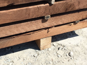
Today it hit me. I was walking across the lumber yard and watching a forklift unload a pack from a shipping container. As the lift lowered the lumber to the 3×3 bolsters we use to raise lumber off the ground, I saw it. This particular bolster for some unknown reason had a notch cut out of the end. Imagine a big rabbet on the end of it. When the lumber pack was set on top of it, it appeared to be floating over the bolster.
This floating cabinet idea is far from a new one and you will see if everywhere once you start looking. But it was that tiny detail that got me thinking not about changing the Lingerie chest itself but instead changing the base.
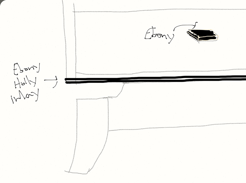
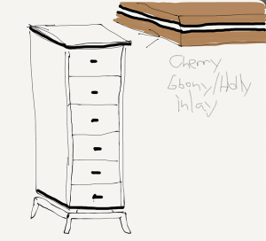
Out comes my tablet and stylus and I’m sketching away. A french foot with scalloped cross pieces creates an elegant foot and floats the case above it. Just using quality materials and construction will dress up the case above it and ensure that I maintain the overall look and function that is so dear to my wife.

The Woodworker’s Curse
Now to the details, where I screw up the design and flabbergast my wife because like all woodworkers I have to over complicate things and add details that add nothing to the design. I admit that the blocky case bothers me. I also admit that my overwhelming prejudice against the existing chest has given me a serious bias. So I feel like I need to mess with the design there. However I keep hearing my wife’s voice telling me not to mess with it. So I start sketching ideas where I do a complementary species drawer front or a figured drawer front. Then I start looking at stringing on the drawer fronts instead. Both of these significantly change the look and feel of the piece and I realize that messing with the case itself actually does more harm than good to the simplicity of the design.
Anything I add to it makes it feel showy and pretentious. So I do what everyone does when they hit a creative wall…go to lunch. As I sit eating a sandwich and staring at a wooden fence it hits me. A typical wooden fence is boring, vertical planks stacked next to each other. What makes it interesting is the shape of the tops of each plank. Some just come to a point, while others add cut outs and play on negative space. But everything below that is just straight lines.
My case is the same situation. I need to keep the straight, blocky lines of the case and avoid changing any of that. Make it well and it will be sufficient. But if I add a simple contracting inlay along the edge of the top, it changes everything. I blame Garret Hack for this as I’m definitely channeling his designs here with a Ebony and Holly straight line inlay.
 Then because I can’t leave well enough alone, I sketch in the same inlay at the bottom of the case right above the floating base to punctuate the transition as well as highlight the floating effect. Finally I sketch in some blocky, Ebony drawer pulls. That part will evolve later, but I think the Ebony (or something dark) will tie together the inlays.
And I’m done. I’ll build the whole thing in Cherry to match the Cherry of the bed in the room already and with just an alteration of the base and a tiny bit of inlay at the top and bottom of the form, I’m pretty happy with the idea. Whats amazing is just how little I had to change the design from the form that I hate so much to be truly excited about the new piece.
Now I just need to get the wife’s approval on the design.


