Proportional Models in SketchUp
 I have often stated that I use SketchUp in the early stages of my projects to work out basic dimensions and solve any joinery problems. Rarely do I actually model the joints but just creating parts and fitting them together in a virtual space is extremely helpful. The biggest help that SketchUp gives me at this planning stage is in figuring out the proportions of my build and whether it looks good but also meets the functional demands. This doesn’t require anything but the most basic knowledge of the application as I work with solid blocks much like an artist will boil down a portrait to basic geometric shapes. This process in SketchUp is stupid simple that even my limited skill with it can allow me to figure out the basic shapes and sizes of a furniture projects before I spend too much time playing with details.
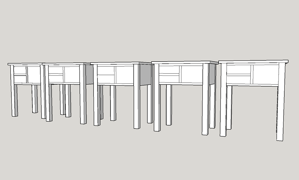
With the basic shape created I can now play around with sizes like the top overhang or the height of the body of the table itself. What I find most helpful is copying these models side by side and playing with the proportions so I can clearly see the before and after effect.
For instance with this bedside table I’m creating I feel that the drawer assembly is too fat. At the same time I want to make sure the drawers are functional and not too shallow. I’m keen on the asymmetric design but I don’t want the taller drawer on the right to be clunky and too deep or it will make more sense as a cabinet door instead. So by playing around with the push pull tool and moving the lines of my drawer dividers I can see how the piece would look with several different proportions.

In the end I decided upon the far right model where I shrunk the body of the table down a bit and also thinned out the drawer blades to lessen that clunky feel. This whole process took me just a few minutes and now I can begin to work in the details to the model knowing that I’m starting from a pleasing form that will also make for useable drawer sizes.
By the way this will be a bedside table that I’m building in Semester 6 of The Hand Tool School. It is based on a Sheraton style piece with a little Shaker asymmetry thrown into the mix and some incredible Birdseye Maple drawer fronts. Should be a lot of fun to build.
Your Turn
How do you sort out the proportions of your own designs? Dividers and paper? Wing it? Please share your techniques in the comments below.


